
Resources
4 min read
Your organization, irrespective of its size, is likely creating a substantial amount of data, and deriving value and insights from this data is vital. This is where dashboards can assist you. With reporting dashboards, you can cut through the noise, and select the metrics that are pivotal to your team to begin visualizing them and the trend of these metrics through continuous monitoring, enabling your team to acquire actionable insights. Also, due to the extent of data that today’s organizations now process, dashboard creation can be viewed as a necessity rather than a luxury.
Utilizing dashboards to provide enhanced visibility into the performance of your IT environment by monitoring key metrics is a powerful practice. With the extensive array of tools supplying visualization capabilities and the broad variety of metrics that you can monitor the possibilities of dashboard creation are almost endless. Therefore, viewing a range of dashboard examples can help you make an informed decision when selecting a tool for your organization.
Interactive dashboards take monitoring your data to the next level as they are dynamic, rather than static and utilize real-time data. This interactivity of the dashboards allows enhanced customizability, as well as the ability for you to drill down into specific metrics for further analysis.
Within this article, we will define what interactive dashboards are, outline a range of interactive dashboards examples, and cite the tools used to build the dashboards, to assist you in comprehending the benefits of interactive dashboards and how you can utilize them for your own needs.
Contents
-
What are Interactive Dashboards?
- Web Server Statistics
- Fraud and Identity Theft
- Brand Analysis and Topic Tracking
- Application Performance Monitoring
- Global Market Overview
- Google Ads
- E-commerce Sales
- Credit Card Customer Data
- Active Learning
- Formula 1
- Predictive Models
- Office 365
- Digital Marketing
- Hotel Management
- Environmental Insights
What are Interactive Dashboards?
Interactive dashboards are visual representations of data that enable users to interact with and investigate information dynamically. These dashboards often consist of multiple data visualizations, charts, graphs, and other elements that supply a real-time or near-real-time perspective of key metrics and performance indicators. The interactivity aspect enables users to manipulate and customize the display of information to suit their needs.
Interactive dashboards differ from static reports mainly as they use real-time data, whereas static reports utilize historical data. As well as this, interactive dashboards offer a centralized view of numerous data sources, with static reports you need to generate a variety of reports for different data sources. To assist you in comprehending the extensive capabilities of interactive dashboards, we have listed 15 examples and the tools used to build the dashboards below.
Web Server Statistics
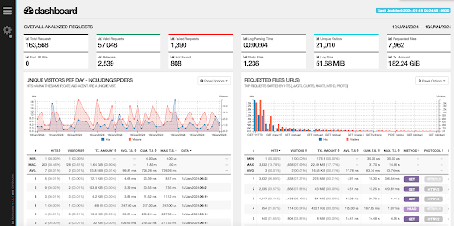 This interactive dashboard for web server statistics is built on GoAccess, an open-source real-time web log analyzer and interactive viewer. It operates either in a terminal on Unix systems or through your browser. The solution offers fast and valuable HTTP statistics for system administrators who need a visual server report on the fly. This dashboard highlights a variety of metrics including but not limited to requested files, unique visitors per day, and log parsing time.
Fraud and Identity Theft
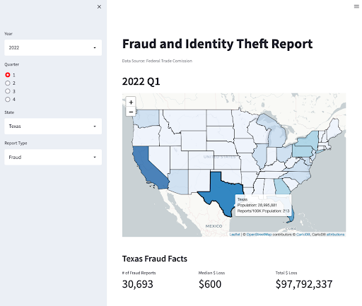 This dashboard is built on Python Streamlit which visualizes data in an interactive folium map. For this specific example, the dashboard presents a fraud and identity theft report published by the Federal Trade Commission. With this dashboard, you can view metrics such as the number of fraud reports, and the total number of dollars lost, as well as other metrics. Also, you can alter the report type, year, quarter, and state.
Brand Analysis and Topic Tracking
![]() This dashboard focuses on analyzing X, formerly Twitter, data to drive better business decisions. The dashboard is built on Heroku and enables users to monitor real-time data relating to a topic or brand on X/Twitter. With this dashboard, you can monitor a range of metrics including but not limited to, potential impressions today, tweets posted today, and geographical segmentation for your topic or brand.
This dashboard focuses on analyzing X, formerly Twitter, data to drive better business decisions. The dashboard is built on Heroku and enables users to monitor real-time data relating to a topic or brand on X/Twitter. With this dashboard, you can monitor a range of metrics including but not limited to, potential impressions today, tweets posted today, and geographical segmentation for your topic or brand.
Application Performance Monitoring
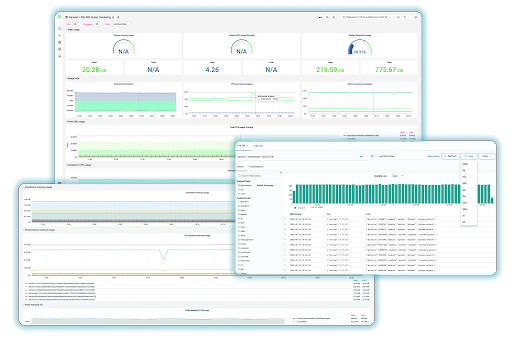 With Logit.io you can create a variety of dashboards, depending on your requirements, this example focuses on application performance monitoring (APM). Utilizing Logit.io’s interactive dashboards for APM, you can clearly view the performance of your application and drill down into specific metrics to simply locate the specific area of an issue. Also, with Logit.io dashboards you can set up alerting so that you can quickly react when an issue occurs.
Global Market Overview
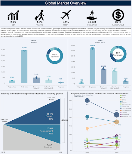 This dashboard, created in Tableau, presents the global market overview, specifically the air travel industry, created by Boeing, but this dashboard can be utilized to provide context for any industry. The dashboard helps businesses in the air travel industry make data-driven decisions by monitoring the trends of the data. The dashboard includes metrics such as percentage of GDP, market value, and total fleet.
Google Ads
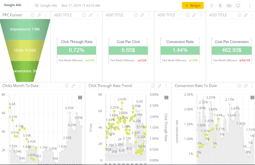 This dashboard is a specific marketing example that presents Google Ads data, created in Sisense. Whilst Google Ads provides the majority of the data shown in the dashboard, presenting it in this manner enables much more effective analysis to help you see where you should focus your efforts. The dashboard shows metrics such as click-through rate trend, conversion rate, and PPC funnel.
E-commerce Sales
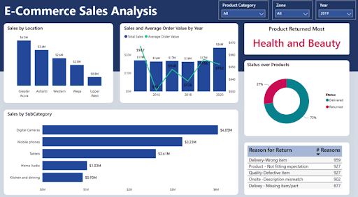 Microsoft Power BI was used to create this e-commerce sales dashboard that provides users with a high-level comprehension of how different products are performing. The dashboard can be filtered by product category, zone, and year. The dashboard presents a range of metrics including but not limited to sales by location, sales and average order value by year, and sales by subcategory.
Credit Card Customer Data
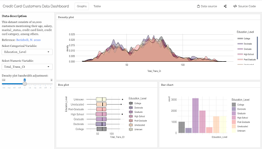 This is an interactive dashboard highlighting data relating to customers' credit cards. The dataset is from Kaggle and consists of 10,000 customers mentioning their age, salary, marital status, credit card limit, credit card category, and other statistics. The dashboard was built using Power BI and shows metrics a range of metrics that can be selected from the filters.
Active Learning
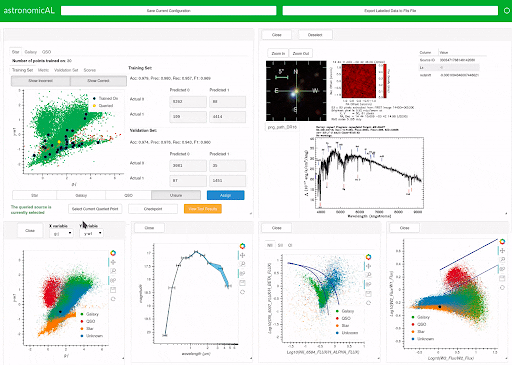 This dashboard presents data for active learning. It's built on AstronomicAL, a human-in-the-loop interactive labeling and training dashboard that enables users to design reliable datasets and robust classifiers using active learning. The system allows users to visualize and integrate data from varying sources and deal with incorrect or missing labels and imbalanced class sizes by utilizing active learning to assist the user in focusing on correcting the labels of a few key examples.
Formula 1
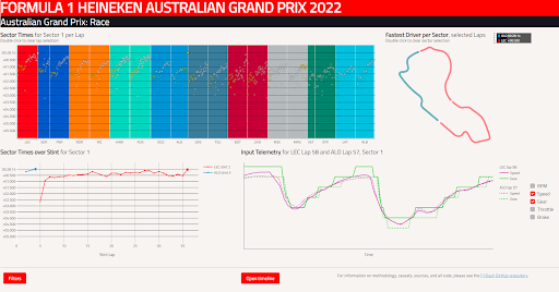 This dashboard, labeled F1Dash, is an interactive dashboard based on Formula 1 timing and telemetry data. The main objective is to supply an overview of which drivers/teams are fast during a given session, whilst enabling the user to probe the data and explore the differences in performance between drivers, right down to individual sections of track.
Predictive Models
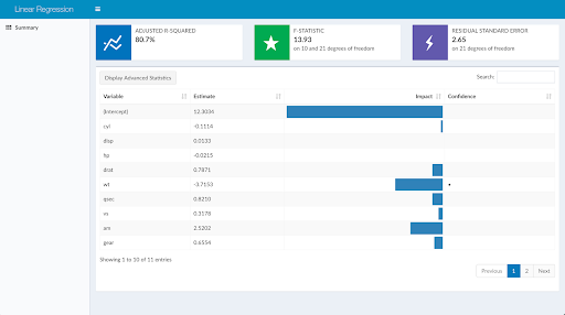 Created with FlightDeck which intends to make it much simpler to design interactive dashboards for reporting outputs of predictive models, this dashboard represents data relating to predictive modeling, specifically linear regression. With this dashboard, you can view a range of metrics, including but not limited to adjusted R-squared, F-statistic, and residual standard error.
Office 365
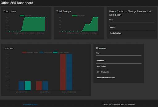 This live and interactive Office 365 dashboard was designed with Powershell. You’re able to interact and explore each chart, graph, and table to further analyze your Office 365 subscription and its users. With this dashboard, you can view a variety of metrics including but not limited to total users, licenses, and domains.
Digital Marketing
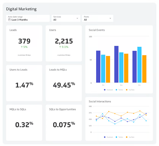 This digital marketing dashboard is similar to the Google Ads dashboard but provides a more top-level view of your entire digital marketing efforts. Utilizing this dashboard you can effectively monitor digital marketing metrics that measure your success at reaching your target audience. With this dashboard, you can view metrics like leads, users, social interactions, MQLs to SQLs, as well as others.
Hotel Management
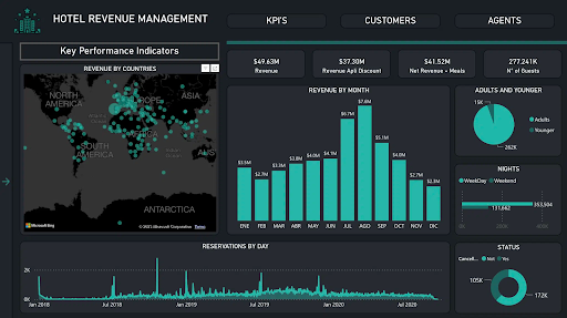 This dashboard was created with Power BI and presents metrics relating to hotel management. With a particularly clean design, this dashboard is effective at providing an overview of a hotel's most important statistics. By utilizing this dashboard you can view metrics including but not limited to revenue by month, number of guests, and net revenue.
Environmental Insights
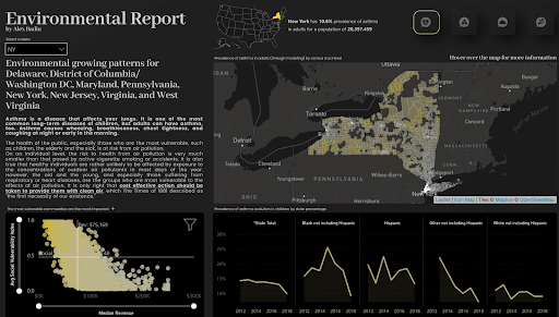 This dashboard is again created with Power BI and highlights environmental statistics and metrics. The dashboard has built-in filters, enabling users to select a state to view specific metrics for that specific state and then use this data for accurate comparisons. With this dashboard, you can view a range of metrics such as air toxicity concentration, daily rainfalls, and prevalence of asthma evolution.
If you’ve enjoyed this article why not read the Best OpenSearch Dashboard Examples or the Best Prometheus Dashboards next?