
Resources
4 min read
As organizations produce a significant amount of data from varying sources, simple analytics tools can make it challenging and time-consuming to derive insights from this data. Data dashboards can assist with this. A data dashboard is a visual representation of data that offers an at-a-glance view of key performance indicators (KPIs), metrics, and other important information relevant to a particular business, organization, or process. Data dashboards commonly consist of charts, graphs, tables, and other visual elements that enable users to rapidly interpret complex data and highlight trends, patterns, and insights.
Within this article, we will provide a list of the leading data dashboard examples to help you comprehend the advantages of analyzing data through dashboards. As well as understand the broad range of uses for these dashboards.
Contents
- Datapine Financial KPIs
- InetSoft HR Attrition Management
- Databox Sales Dashboard
- Geckoboard Company Overview
- Klipfolio SEO
- Metabase Company Stats
- Coupler.io YouTube Channel
- Amplitude Product Analytics Dashboard
- Sisense Cyber Analytics
- Adriel eCommerce
- Databox Income and Expenses
- Klipfolio Supply Chain
- Datapine Management KPIs
- Sisense Healthcare Patient No-Shows
- Amplitude Web Analytics
Datapine Financial KPIs
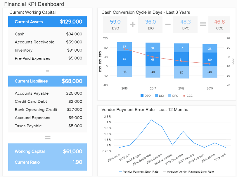
The ability to track your financial health and efficiency is vital to your organization's continual growth and success. This financial KPI dashboard offers visualizations and metrics relating to your critical fiscal metrics and KPIs to ensure they are continuously monitored. Some examples of these fiscal metrics and KPIs include current assets, current liabilities, and vendor payment error rate.
InetSoft HR Attrition Management
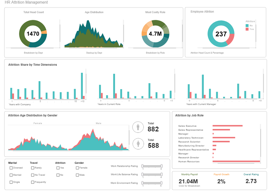
This data dashboard supports HR attrition management and provides complete visibility of numerous critical metrics relating to HR management. The HR attrition management dashboard is designed with InetSoft, a computer software company that designs free and commercial web-based business intelligence applications. By utilizing this dashboard you can view metrics such as total head count, employee attrition, and age distribution.
Databox Sales Dashboard
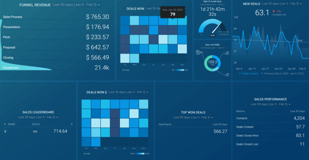
With this dashboard, users can gain a real-time data overview of targets, and progress, with the ability to share the information with clients or stakeholders. With this data dashboard example, you can monitor metrics such as funnel revenue, time to close a deal, and sales leaderboard.
Geckoboard Company Overview
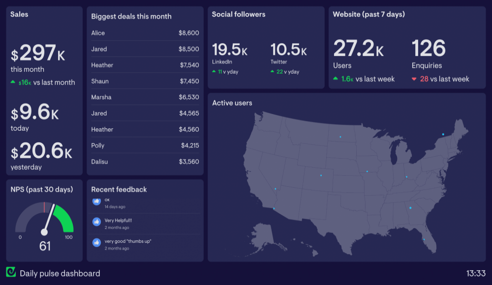
This company overview dashboard aims to build a common understanding of a company’s mission and how they’re progressing toward it. This data dashboard example was designed with Geckoboard, a solution that allows users to monitor all their critical KPIs on one simple dashboard. With this dashboard, you can view a variety of metrics including but not limited to sales this month, social media followers, and website users.
Klipfolio SEO
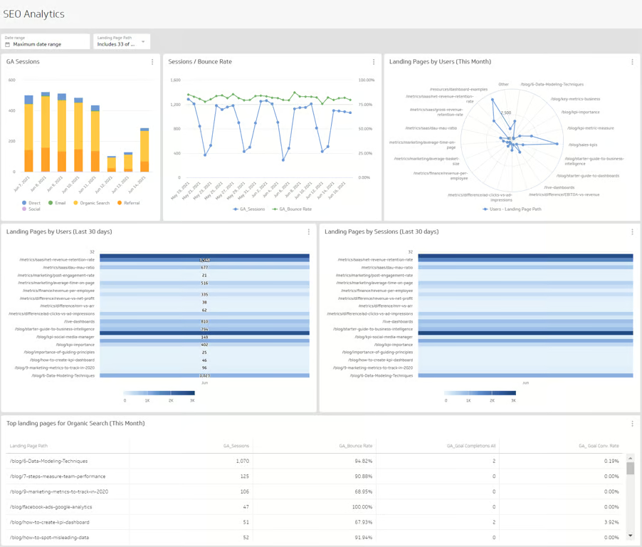
SEO is a vital aspect of any marketing team for teams to truly comprehend their search marketing performance, it’s important to track SEO metrics and monitor changes frequently. With this dashboard designed with Klipfolio, you can gain an extensive overview of critical data points related to your website's SEO performance. With this dashboard, you can visualize metrics like Google Analytics sessions, landing pages by users, and bounce rate.
Metabase Company Stats
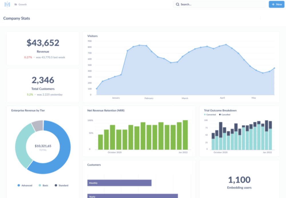
Similar to the Geckoboard company overview dashboard, this data dashboard example presents a variety of metrics relating to a company’s performance. Built with the simple open-source solution Metabase, this dashboard provides complete visibility into the performance of an organization and identifies areas that are causes for concern for efficient management. This dashboard highlights metrics like trial outcome breakdown, net revenue retention, and total customers.
Coupler.io YouTube Channel
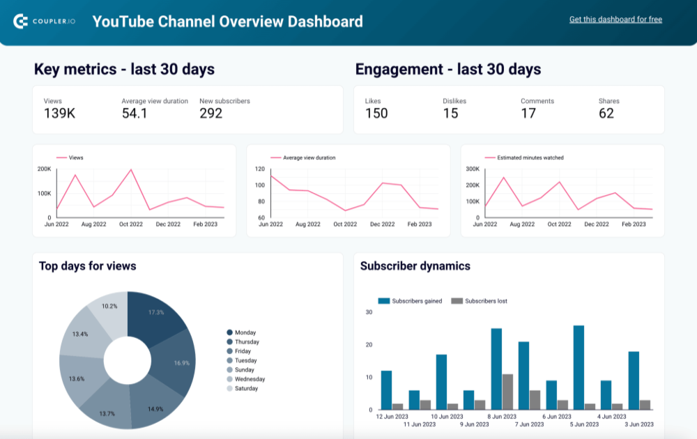
The Coupler.io YouTube dashboard offers valuable insights into video performance, viewer engagement, and content strategy. This data dashboard enables users to monitor essential metrics and gain insights into how viewers engage with and discover their videos. The dashboard offers numerous metrics to monitor such as views, new subscribers, and likes.
Amplitude Product Analytics Dashboard
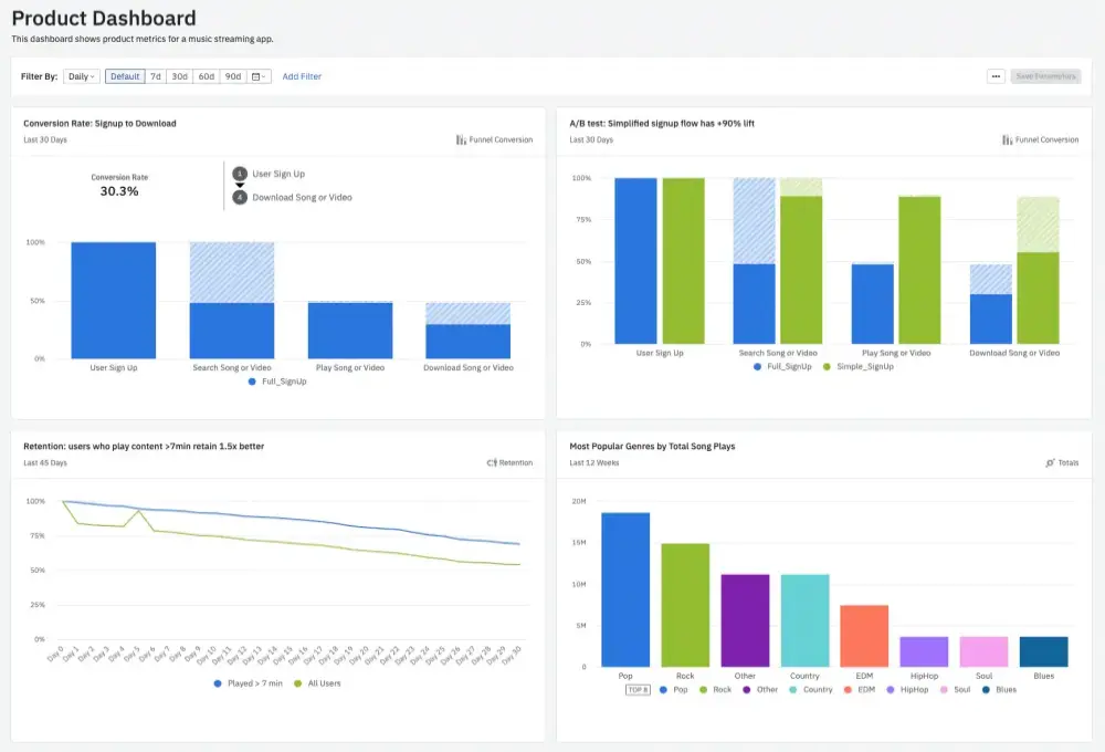
This product analytics overview dashboard is designed to assist product managers in assessing the success of a product or feature. It achieves this by presenting specific key performance indicators (KPIs) relevant to product management. This data dashboard example was built with Amplitude, a product analytics platform that enables users to create better products by tracking and understanding user behavior. With this dashboard, you can monitor metrics like conversion rate, retention rate, and A/B tests.
Sisense Cyber Analytics
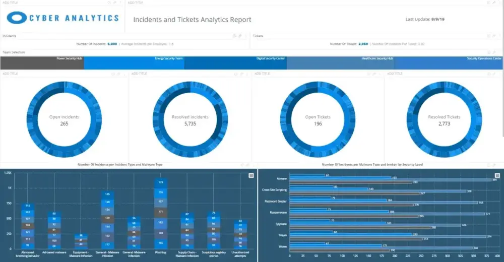
Monitoring and examining cyber threats is a critical practice for almost all organizations, and with this cyber analytics dashboard by Sisense, you’re able to conduct exactly that. Utilize this data dashboard example to track overall cyber threats and response team performance to plan preventive actions for offices which considered to be at risk. Sisense is a business intelligence software company that provides insights for end users.
Adriel eCommerce
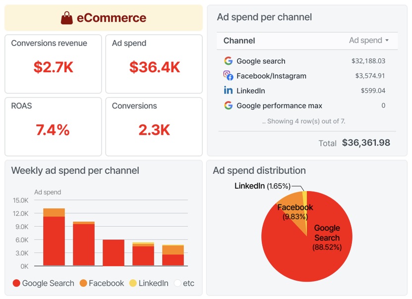
This eCommerce dashboard identifies KPIs, trends, and relationships related to the performance of your eCommerce website and ad campaigns. This data dashboard example was designed with Adriel, a modern ad Operations platform that automates processes to help you make effective decisions faster. With this dashboard, you can visualize a range of metrics including but not limited to conversions revenue, ad spend, and conversions.
Databox Income and Expenses
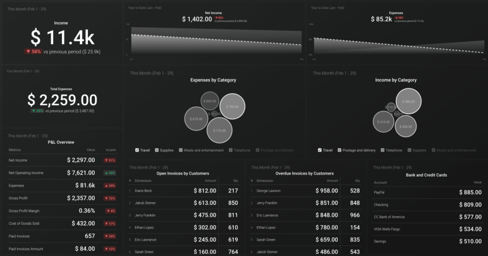
This data dashboard is another example designed with Databox, an all-in-one platform that aims to turn data into insights, focusing on SaaS income and expenses. The dashboard offers insights about cash flow, bank accounts, sales, and expenses entered in Quickbooks to help you stay on top of your business. With this dashboard, you can view a variety of metrics including net income, expenses by category, and income by category.
Klipfolio Supply Chain
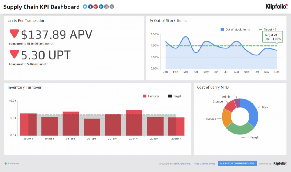
Supply chain tracking is vital for businesses to maintain efficiency, lower costs, and mitigate risks. This supply chain dashboard by Klipfolio allows companies to monitor the movement of goods and materials throughout their supply chains, highlight bottlenecks or disruptions early on, and make informed decisions to enhance operations. With this dashboard, you can view metrics like units per transaction, percentage of out-of-stock items, and inventory turnover.
Datapine Management KPIs
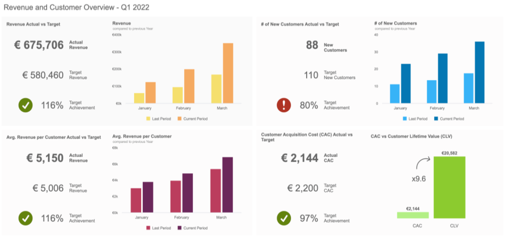
Data dashboards are powerful tools, particularly for management as they allow them to make data-driven decisions. This dashboard is designed with Datapine, an all-in-one business intelligence software that enables its users to explore, visualize, monitor, and share their data. With this dashboard, you can view numerous metrics such as revenue actual vs target, number of new customers, and customer acquisition cost (CAC) actual vs target.
Sisense Healthcare Patient No-Shows
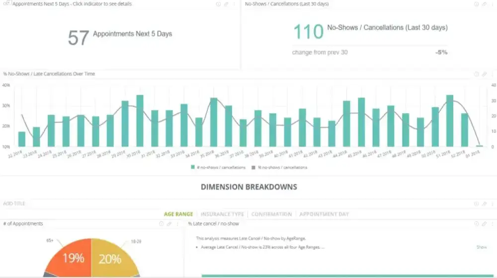
For private healthcare organizations high patient no-show rates (ranging from 5.5% to 50%) negatively impact healthcare by stopping patients from receiving care and decreasing provider revenue. This healthcare patient no-shows dashboard allows you to monitor the rate of patient no-shows and determine the potential impact on your business. With his data dashboard example, you can view metrics such as no-shows/cancellations, number of appointments, and appointments in the next 5 days.
Amplitude Web Analytics
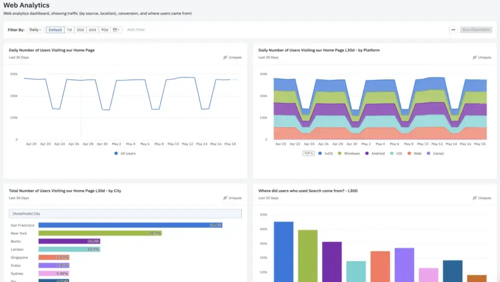
This web analytics dashboard, designed by Amplitude, consolidates key metrics related to your website traffic, offering a centralized overview of essential data points. Utilizing these KPIs within this data dashboard example empowers you to assess the effectiveness of multiple strategies, allowing you to discontinue unproductive marketing efforts while increasing investments in profitable initiatives. With this dashboard, you can view metrics such as number of homepage visitors, goal completions, and bounce rate.
If you've enjoyed this article why not read The Top 15 Splunk Dashboard Examples or The Top 15 Datadog Dashboard Examples next?