
Resources
6 min read
As organisations grapple with increasingly complex systems, applications, and infrastructure, the need for robust monitoring and analytics solutions has never been more critical. DataDog is a well known observability platform that has risen to prominence by addressing these challenges head-on. With DataDog dashboards, organisations can visualise data from across their IT ecosystem in real-time, enabling them to monitor the health of their systems, troubleshoot issues proactively, and optimise system performance.
In this article, we will delve into specific use cases, showcasing how companies from diverse industries have leveraged DataDog dashboards to gain a competitive edge. By the end of this article, you'll gain a deeper understanding of why DataDog is a popular choice for those seeking to unlock the power of data in today's data-driven landscape.
Contents
Tagging Analytics
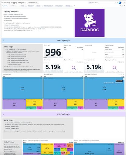 This Datadog tagging analytics dashboard supplies a high level overview of the tag consistency in infrastructure, logs, application traces and Datadog resources like Synthetics, RUM, or Monitors. The dashboard has a variety of use cases for connecting different Datadog products to improve the correlation of metrics and events, ease discoverability, and allocate cost and attribute usage.
AWS Container Monitoring
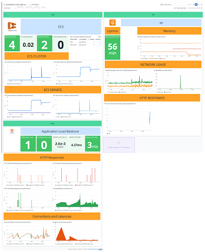 This dashboard is designed to monitor containers on AWS. It uses metrics supplied by the AWS ECS integration, AWS Amazon ELB Integration, and passed logs from ECS. This specific dashboard presents a range of metrics including, but not limited to tasks in desired and running state, memory and CPU utilisation for clusters and services, and load balancer insights.
Kubernetes Capacity Planning
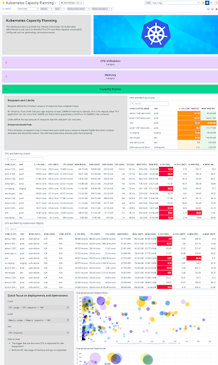 With the Kubernetes capacity planning dashboard you can highlight clusters contributing to the biggest waste of resources in regards to Kuberbetes misconfiguration. This dashboard also highlights the biggest discrepancies between CPU and memory utilisation vs CPU and memory requests.
AWS EC2 - Cloud Optimization
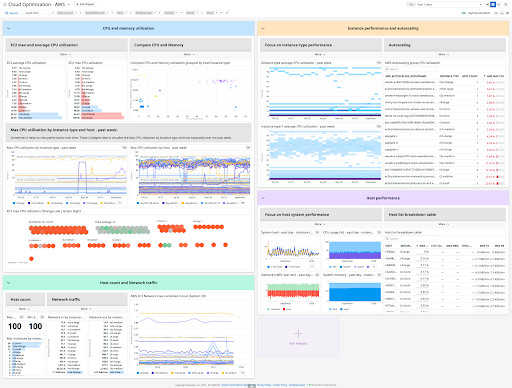 The aim of this cloud optimization dashboard is to supply you with enhanced visibility into the performance of your AWS EC2. With this dashboard you can clearly view the CPU and memory utilisation of your EC2 instance, the host count and network traffic, and the host performance.
JFrog Artifactory Logs
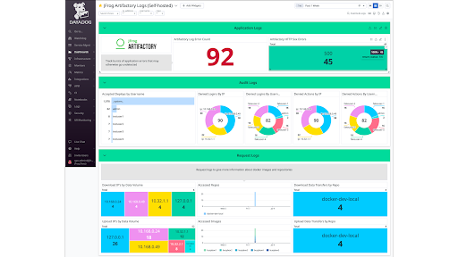 This JFrog artifactory logs dashboard provides informative insights regarding your logs. You can monitor metrics such as accepted deployments by username, artifactory log error count, denied actions by IP, and accessed images, as well as other key performance metrics.
Jenkins
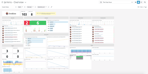 Jenkins is a leading open-source automation server that offers hundreds of plugins to support building, deploying, and automating any project. With the Jenkins dashboard for Datadog you can automatically forward metrics, events, and service checks to Datadog. This particular dashboard enables you to view metrics such as successful vs failed jobs, Jenkins node count, and jobs in the queue.
Akka Applications
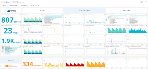 This dashboard is predefined by Lightbend to assist you in gaining a jump-start in monitoring your Akka applications. Akka is a toolkit for constructing highly concurrent, distributed, and resilient message-driven applications for Java and Scala. With this Datadog dashboard for Akka applications, you can view metrics including but not limited to current running actors, mailbox time, and top remote senders.
Auth0
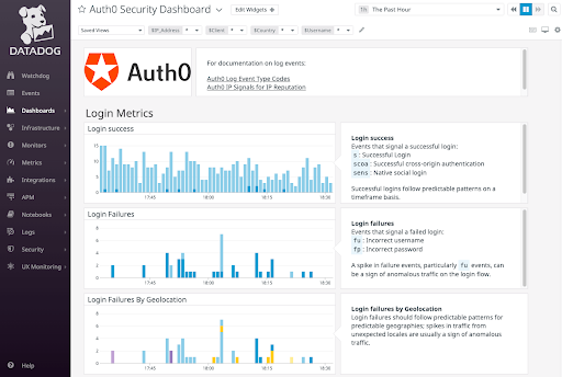 With the Auth0 Datadog dashboard you can view data from your Auth0 tenant in Datadog and monitor the health of the login traffic for a tenant. As well as, use filters to narrow down data analysis using configurable parameters such as IP address, Country, User, and Client Application.
Hightouch
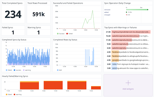 Hightouch integrates with Datadog to provide users with this dashboard that provides detailed observability insights. With this integration, as an example, you can produce dashboards that target specific syncs that are vital to your operations and report the total number of operations or top syncs that have warnings or failures.
CloudFoundry
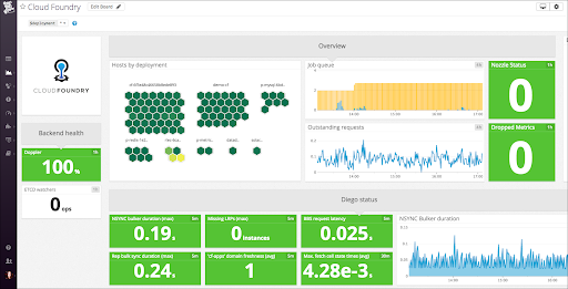 This CloudFoundry dashboard provides metrics relating to your applications for enhanced monitoring. CloudFoundry is an open-source multi-cloud application as a service that operates on top of Kubernetes. With this dashboard, you can view metrics including but not limited to hosts by deployment, BBS request latency, and NSYNC bulker duration.
.Net
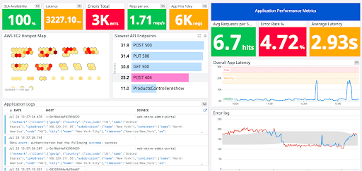 This .Net dashboard aims to modernise .Net applications built on AWS. With this dashboard and integration, you can attain insights into your application and address key challenges in modernising a monolithic .NET application. This dashboard provides a range of metrics, including but not limited to SLA availability, requests per second, and surfacing the slowest API endpoints.
MongoDB
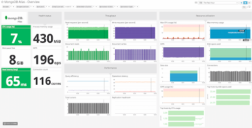 This Datadog dashboard for MongoDB provides MongoDB Atlas customers with the ability to monitor the application stack. The dashboard provides a real-time performance panel consolidating key information such as database operations, disk usage, connections, hot collections, and slow queries into a unified display. This live data is supported by historical data and includes chart visualisations presenting more than eighty throughput, performance, and utilisation metrics for in-depth analysis.
SLO Application Uptime
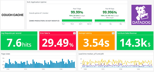
This SLO application uptime dashboard provides enhanced monitoring of service level objectives, specifically application uptime in this example, to provide you with metrics relating to the speed, accuracy, and uptime of a site. With this dashboard, you can monitor metrics such as overall uptime of 1 monitor, average requests per second, and average latency.
PlanetScale
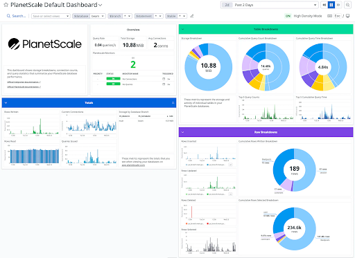 In Datadog you can utilise the PlanetScale integration to design a PlanetScale dashboard that shows storage breakdowns, connection counts, and query statistics that summarise your PlanetScale database performance. The dashboard outlines a range of statistics including but not limited to cumulative query count breakdown, rows inserted, and storage by database branch.
Courier
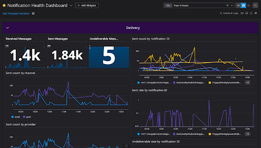 With the Courier Datadog dashboard you can gain data about the health and delivery status of your notifications. Courier is a notification API built for developers, enabling you to design the notification once and push it to any channel. With this dashboard, you can monitor a variety of metrics including but not limited to the percentage of messages that are successfully sent, delivered, opened, and clicked.
Powerful and Cost-efficient Observability from Logit.io
We hope that you found this guide to Datadog dashboards useful, if you are looking for a highly affordable and scalable alternative to Datadog you should consider our Datadog alternative and explore Logit.io’s free 14-day trial to see how we can help you to improve your observability or reach out to us if you have any questions. The Logit.io platform offers a fully customized solution for logging, metrics, and tracing, built on open-source software. It is designed to be scalable, secure, and compliant, meeting the needs of users across various industries.
Leverage the Logit.io platform to diagnose, optimize, and monitor your application performance, enhancing overall observability. With Logit.io, you can gain deeper insights into your applications while seamlessly managing logs, monitoring infrastructure, and launching compliance and auditing dashboards—all from a single, centralized observability platform.
Also, Logit.io brings the best open-source technologies to enterprise-level scalability, compliance, and readiness. Whether you need Prometheus, Grafana, or OpenSearch, Logit.io offers fully hosted versions of the open-source observability tools you want to use, tailored for any enterprise use case.
Unlock complete visibility with hosted ELK, Grafana, and Prometheus-backed Observability
Start Free TrialIf you found this article informative then why not consider reading New Relic alternatives or Sumo Logic alternatives next?