
Resources
6 min read
The ability to extract meaningful insights from your wealth of organisational information is often the key differentiator between successful businesses and those struggling to stay competitive. Splunk, a renowned leader in the realm of data analytics and visualisation, has emerged as a powerful ally in this quest for actionable knowledge.
One of the most compelling aspects of Splunk dashboards is their adaptability to diverse sectors. Whether you're in cybersecurity, IT operations, or business intelligence, Splunk dashboards can be tailored to provide the insights you need to make informed decisions. In the realm of cybersecurity, for example, organisations can utilise Splunk dashboards to detect and respond to threats in real time, helping protect sensitive data and networks from malicious actors.
In this article, we will explore the best use cases for Splunk dashboards across these and other domains. We will showcase real-world examples of organisations that have harnessed the power of Splunk dashboards to transform their data into actionable insights, enabling them to stay ahead in today's data-driven landscape. Join us as we delve deeper into the remarkable capabilities of Splunk dashboards and discover how they are revolutionising data-driven decision-making across a multitude of industries and functions.
Contents
CyberArk
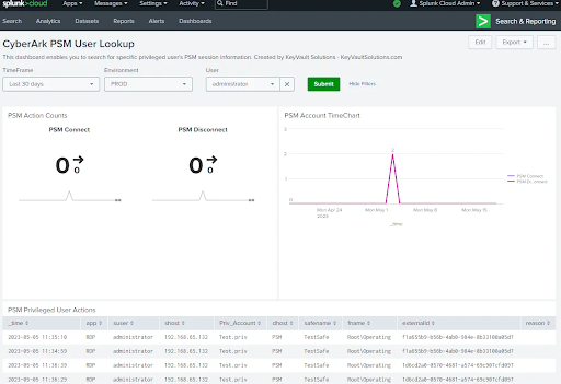 By utilising this CyberArk Splunk dashboard, you can gain a head start with improved visualisations, allowing you to share visualisations with other key stakeholders for further analysis. In this particular example, it's crucial to configure CyberArk Vaults to send syslog data to Splunk SIEM, and simultaneously, configure Splunk SIEM to ingest these logs.
DNS Hunting and Beaconing
![]() The core of this dashboard is populated with information from parsing DNS Queries. Utilising the trusted domains list isn’t necessary, however, it is recommended to filter out some of the noise from the panels. The dashboard presents a range of metrics including, but not limited to beaconing activity, hosts talking to beaconing domains, and DNS packet size distribution by host.
The core of this dashboard is populated with information from parsing DNS Queries. Utilising the trusted domains list isn’t necessary, however, it is recommended to filter out some of the noise from the panels. The dashboard presents a range of metrics including, but not limited to beaconing activity, hosts talking to beaconing domains, and DNS packet size distribution by host.
Node Monitoring
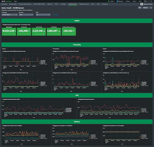 This node monitoring dashboard utilises Splunk Connect for Ethereum to pull infrastructure monitoring metrics. With this dashboard, you can monitor your nodes for Splunk Infrastructure Monitoring, OpenTelemetry, or Prometheus. In this specific example, you can view metrics for processing (such as transactions and events), CPU, and Memory.
Homelab Monitoring
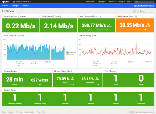 In this example, the dashboard presents the backup status, amount of leftover storage space, network performance, and battery status. Also, It supplies secondary dashboards in different tabs that offer further insights into the power and storage state of the homelab.
Active Directory Domain
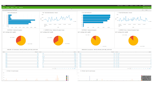 This active directory dashboard surfaces informative metrics for you to monitor your domain. Splunk SIEM is utilised to enable you to view metrics such as login load by domain controller, aggregate auths, Kerberos encryption types in use, NTLM usage/data, and Firewall information. This will provide you with a holistic view of your entire name for effective monitoring.
Netflow Analyzer
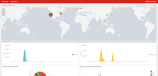 The Netflow analyzer dashboard enables you to begin collecting and visualising Netflow data with Splunk. Security professionals and administrators can use this dashboard to capture data on network traffic, examining flows to identify potential bottlenecks or security incidents throughout the corporate network.
Attack Range Reporting
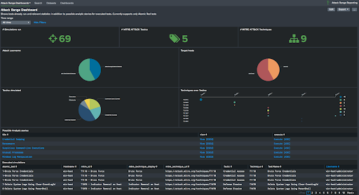 The attack range reporting dashboard allows users of Splunk Attack Range to attain an enhanced view of what simulations were run, relevant security content from other Splunk apps, and an overview of the available Atomic Red tests. The main dashboard supplies an overview of the simulations run, users, hosts and potential mapping with analytic stories.
Quick Health Check App
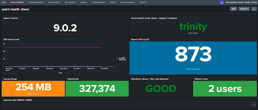 This dashboard offers a quick health assessment of the Splunk environment with some basic statistics. It can be particularly beneficial during Splunk delivery and when the Splunk Monitoring Console has not been factored into the solution. Also, the dashboard supplies a secondary dashboard that shows all the Splunk-managed assets and source types.
MarkLogic Monitoring
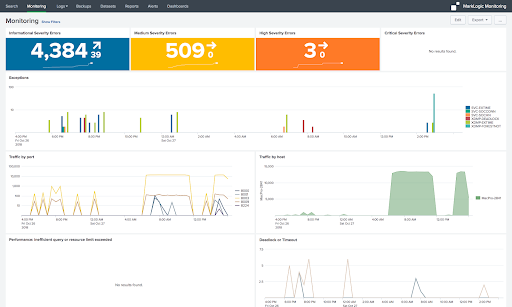 The MarkLogic monitoring for Splunk dashboard supplies configurations and pre-built dashboards that provide real-time visibility into Error, Access, and Audit log events to monitor and examine MarkLogic logs with Splunk. The dashboard offers a range of metrics including, but not limited to informational severity errors, traffic by port, traffic by host, and critical severity errors.
Ethereum Gas Analytics
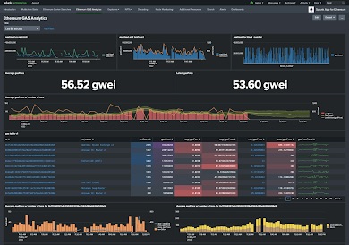 This Ethereum gas analytics dashboard is another example of a dashboard that utilises Splunk Connect for Ethereum. With this dashboard, you can attain real-time visibility into the fees being charged to execute transactions on Ethereum. It also includes some machine learning to predict whether gas prices will increase or decrease in the future based on past history. You can view metrics like gas used vs gas limit, average gas price, and gas used by block number.
ArgoCD
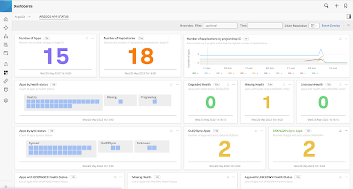 ArgoCD servers produce a series of metrics that can be shipped to Splunk Infrastructure Monitoring. Some of these metrics that you can monitor by leveraging this dashboard include, but are not limited to, the number of apps, the number of repositories, the number of applications by project, and apps by health status.
Defensive Monitoring Environment
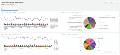 This dashboard is part of a group of dashboards designed to fortify organisational security by harnessing the capabilities of Splunk Security Information and Event Management (SIEM). With the complete project, you can implement an advanced cybersecurity framework that monitors your organisation's digital ecosystem, supplies actionable insights via intuitive dashboards, conducts baseline analysis, and effectively detects and mitigates cyber threats. This specific dashboard monitors the Windows server and tracks metrics such as the count of different users, the count of different signatures, and others.
App Purchase Dashboard
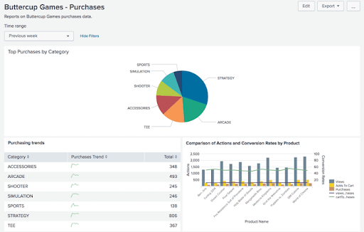 This app purchase dashboard is specific for Buttercup games and shows the number of purchases for each game category. There’s also a small graph that presents the purchase trend, highlighting if a category's total purchase value has increased or decreased when compared to previous trends.
Booking and Reservations
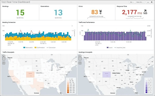 This dashboard visualises hotel bookings and reservations, combining both static and real-time data. The dashboard utilises advanced indicators, choropleth charts, and combo charts to contrast the customers' experience on the hotel's website. The most unique feature of this dashboard is the use of a choropleth chart to produce a location-based analysis of bookings and website traffic.
Remote Work Insights
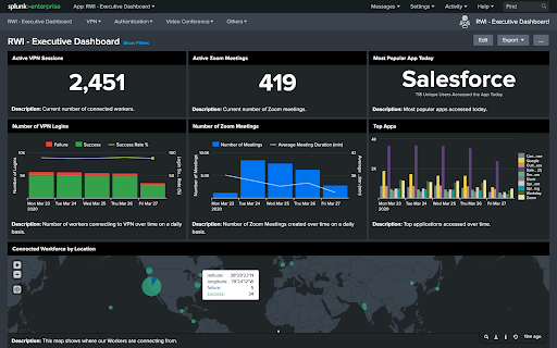
This remote work insights executive dashboard is designed to offer the ability to aggregate information via VPN, authentication, and video conferencing services to provide insights into the connectivity, productivity, and engagement across a remote workforce. This dashboard lets you view metrics such as active VPN sessions, active Zoom meetings, and connected workforce by location.
We hope that you found this guide to Splunk dashboards informative, if you are looking for a highly affordable alternative to Splunk you should consider our Splunk alternative observability solution and explore Logit.io’s free 14-day trial to see how we can help you to centralise organisational data with ease.
Logit.io offers the best-in-class open-source tools as hosted solutions including Grafana, OpenSearch Dashboards, and Prometheus. Configuring and maintaining these solutions can be particularly challenging and time-consuming so numerous organizations have opted for hosted solutions to enhance their operations. If you’re interested in finding out more about Logit.io’s cost-effective and feature-rich platform then feel free to contact us or begin exploring the platform for yourself with a 14-day free trial.
Unlock complete visibility with hosted ELK, Grafana, and Prometheus-backed Observability
Start Free TrialIf you found this article informative then why not consider reading Splunk alternatives or Dynatrace alternatives next?