Resources
9 min read
Last updated:
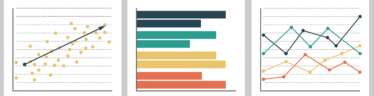
If you have been trying to compare all of the best data visualisation tools you may have found it difficult to find a detailed list that includes both open-source and proprietary solutions to help you compare and make an informed decision on what you need going forward.
In this guide, you will find out everything you need to know about the leading solutions for data visualisation to help you get started with your next analysis project.
We’ve also included links to a number of resources where you can view data visualisation examples across a wide variety of use cases.
Contents
1. Grafana
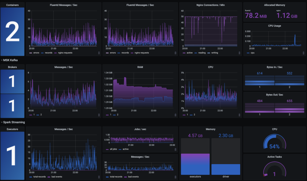
Grafana is an open-source visualisation tool that is the favourite solution of many engineers who wish to report on key metrics in a visually informing way. This open-source solution is often used in tandem with tools such as Graphite, InfluxDB and Prometheus, which all serve to further enhance Grafana’s rich feature set.
Grafana allows you to use a variety of charts, graphs, and tables in order to make your metrics reporting easier so that you can share key insights for enhanced team collaboration.
If you want to see some of the best examples of Grafana in use then head on over to our guide showcasing the best Grafana dashboards.
Key Features:
- Tables
- Gauges
- Timelines
- Time-series
- Bar & pie charts
2. Kibana
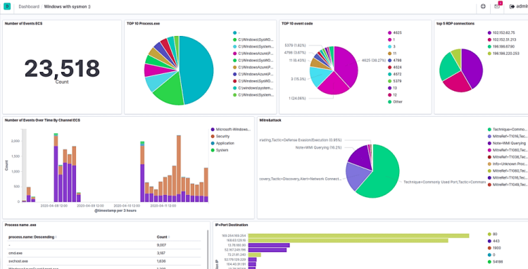 Kibana is a highly popular visualisation user interface (UI) that is commonly used to add visual context to log files by allowing users to create charts for use in reporting dashboards. This tool is commonly used by those in the field of data analysis as well as by engineers in Development and DevOps roles
Up until version 7.10.2, Kibana was an open-source solution until the SSPL license change was made in early 2021. Thankfully a number of providers have committed to keeping open-source distributions of this tool alive so you can still use Kibana as it was meant to be used for all of your analytics as a service needs.
See all of the leading use cases for this solution next up in our article covering the leading Kibana dashboards.
Key Features:
- Gauges
- Tag clouds
- Heat maps
- Data tables
- Coordinate maps
- Line and pie charts
3. OpenSearch Dashboards
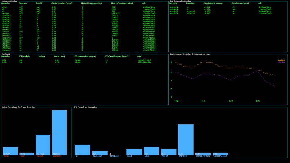 OpenSearch Dashboards is a data visualisation UI based on a fork of Kibana 7.10.2 and offers improvements on out of the box Kibana by adding additional security necessary for organisations to operate in compliance with leading data compliance regulations such as NIST, CMMC and SOC 2. If you've not previously heard about CMMC then you can find out more in our guide; what is CMMC?
As OpenSearch Dashboards are an open-source solution with a public roadmap we can also see a preview of features to come for this all-new visualisation tool, including drag and drop report creation and support for alerting upon audit logs.
Key Features:
- Tenancy
- Notebooks
- Gantt charts
- On-demand CSV reports
4. Logit.io
 If you want to use all three of the aforementioned tools in this list (Kibana, OpenSearch Dashboards & Grafana) side by side then you should consider using Logit.io.
The Logit.io data monitoring and observability platform ensures that anyone who creates log or metrics data has complete visibility of their infrastructure.
Logit.io also offers compliance and auditing functions alongside all of the features required for you to visualise your data and create intuitive reporting dashboards suitable for a wealth of technical and non-technical use cases.
Key Features:
- Unlimited users
- Custom dashboards
- Alerting and notifications
- Autoscaling pen platform
- Enterprise uptime SLAs available to 99.999%
- Highly available data centres in EU, UK and US regions
- NVMe backed hardware for enhanced big data processing
- Authentication options including SSO, SAML, Google, Azure, Github, Email and more
5. Tableau
 Tableau is one of the most well known and widely used data visualisation tools operating in the marketplace today. Some users of this solution note that it is best used for displaying already validated metrics in order to highlight them to key stakeholders instead of as a method of conducting exploratory analysis.
This tool is able to display relatively simple data sets beautifully but for more complex use cases a lower level analysis tool may be required for accuracy.
Key Features:
- Maps
- Mobile view
- In-memory data
- Data source integrations
- Collaboration & sharing features
6. Google Data Studio
 Google Data Studio is a tool for converting data into highly customisable, dynamically updating dashboards. It is often used to build out reports from data stored in Google Analytics and Google Ads.
When compared to Power BI, Google Data Studio is rated by some sources to be better value for money and both of these solutions rate neck and neck for functionality (Source: Software Advice, 2021).
Key Features:
- Charts
- Blend data
- Add pages
- Date range
- Filter control
- Edit vs view permissions
7. Microsoft Power BI
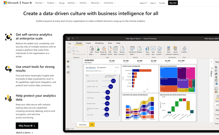 Power BI is an intuitive platform able to provide many smart data visualisation features. With the help of Power BI visuals and efficient tables, you can easily convert raw data into useful insights and statistics.
When compared to another popular solution Tableau, Microsoft Power BI stands out primarily due to its higher satisfaction levels measured for the ability to understand their user’s needs and the strength of their cloud BI (Business intelligence) offering. Both of the aforementioned tools are equally rated regarding their ease of use to deploy and administer (Source: Gartner, 2021).
Key Features:
- Trend indicators.
- Customizable dashboards
- Navigation pane reporting
- Online analytical processing (OLAP)
8. Plotly Dash
 Plotly Dash seeks to give its users the ability to use a powerful Python framework to create interactive web applications and dashboards. Dash uses a modern user interface built upon React and Flask to add elements such as sliders and dropdowns to your data reporting dashboards.
When compared to another visualisation solution, Bokeh, Plotly is rated higher by its users across a number of bases including its inherent 3D graphing functionality and the fact that their library is more fully featured in comparison.
Key Features:
- Create dashboards
- Scale easily with stateless design
- Build web apps using Python analytics
- Use machine learning (ML) and natural language processing (NLP)
9. D3.js
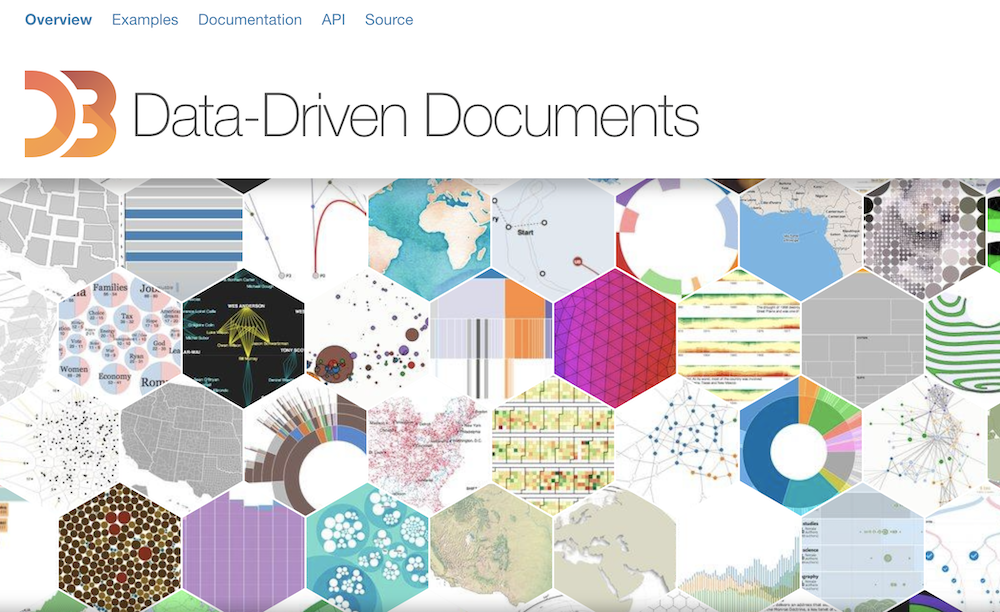 D3.js is a favourite tool by many practitioners of Data Science as this Javascript library is able to produce very impressive and complex results more so than proprietary tools such as Tableau. D3 may be an overshot if the data you wish to visualise is fairly simple in its scope, this tool is also able to integrate with Power BI to produce custom chart types.
Key Features:
- Uses canvas, SVG and HTML
- Built-in element inspector for debugging
- Uses a data-driven approach for dom manipulation
10. Ggplot2
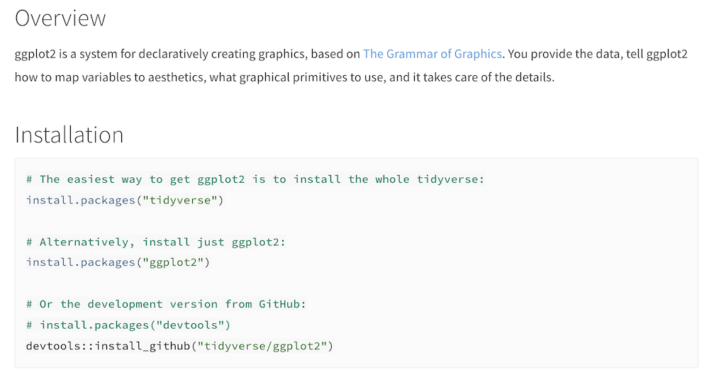 Ggplot2 provides data scientists with an open-source data visualisation tool for the R programming language. This tool is able to be used for so many visualisation types that there are top fifty lists just to name some of the best ones.
If you need to display your data in any of the following formats then this may be the tool for you:
- Jitter plot
- Lollipop chart
- Waffle chart
- Calendar heat map
- Dumbell plot
- Population pyramid
Key Features:
- Vector helpers
- Autoplot and fortify
- Use axes and legends
- Layer geoms, stats and annotations
11. Matplotlib
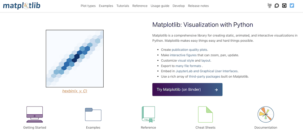 Matplotlib is a 2D plotting library built for the Python programming language that serves as a highly feature-rich visualisation tool. This tool’s graphical representations are able to range from dot plots and diverging bars through to stacked area charts and dendrograms.
Users who try to use this tool do note that this tool is particularly hard to learn as the is a low-level library instead of a ready to go user interface. The latter of these two options is notably easier to configure and use.
Key Features:
- Coloured labels in legends
- 3D plots support minor ticks
- Generate complex subplot grids
- rcParams can be passed as decorators
12. SAS Visual Analytics
 SAS Visual Analytics is a well-established data analytics solution that has been operating for over four decades. Documentation for this solution is anything but brief as one of their recent user’s guides (7.4) was in excess of 670 pages. If you are new to the platform it is well worth getting yourself up to speed with supporting documentation to ensure that you are making the most of the platform.
When compared to Tableau, SAS Visual Analytics is typically rated higher for its Extract, transform and load (ETL) capabilities, data storage and overall quality of its technical support (Source: Gartner, 2021). Both Tableau and SAS are rated equally by users for their embedded advanced analytics.
Key Features:
- Ad hoc reporting
- Real-time analytics
- Predictive analytics
- Data transformation
13. Minitab Connect
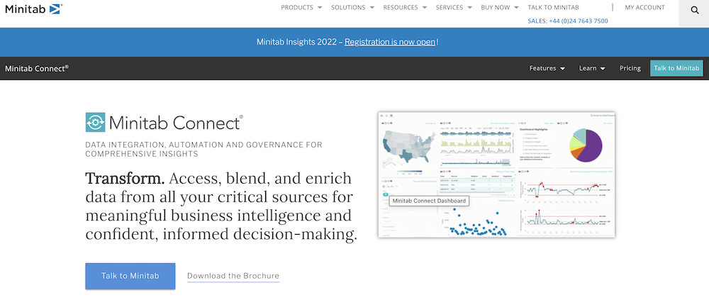 Minitab Connect grants users the ability to get started with predictive modelling by making data integration much more seamless via the use of their platform. As part of this functionality, Minitab Connect is able to not only cleanse data but is also able to store and share data from a single centralised platform.
Key Features:
- Pre-built data connectors
- Embedded validation tools
- Blend and enrich data from multiple sources
- Insert custom PHP, Python, Perl and SQL where required
14. Oracle Data Visualization Cloud
 The Oracle data visualisation cloud service offers both data visualisation and infographic data layouts for users to display their data as they see fit. This tool can be used with Python scripts to train and apply models to custom Machine Learning algorithms that the user wishes to create for added extensibility.
Key Features:
- Discover correlations, patterns, and trends
- Export projects and applications for sharing
- Quickly send data from a variety of sources
15. IBM SPSS
 IBM SPSS software is a platform that offers advanced statistical analysis and is often used on an ad hoc basis for creating detailed reports. This data visualisation software is noted by users as being both an elaborate and powerful piece of software that is well suited for handling large data sets.
You can also undertake specialist training to become a certified IBM SPSS user which new candidates in the world of business analysis can find helpful to add to their resume.
Key Features:
- Text analysis
- Open-source extensibility
- Advanced statistical analysis
- Library of machine learning algorithms
We hope that you enjoyed this list of the best data visualisation tools you should consider using for your next project. If you think we’ve missed including a tool that you use for visualisation purposes? Then feel free to send your feedback to [email protected]
If you enjoyed this guide then why not check out our blog on the best application performance monitoring tools or our article about the best software deployment tools?